
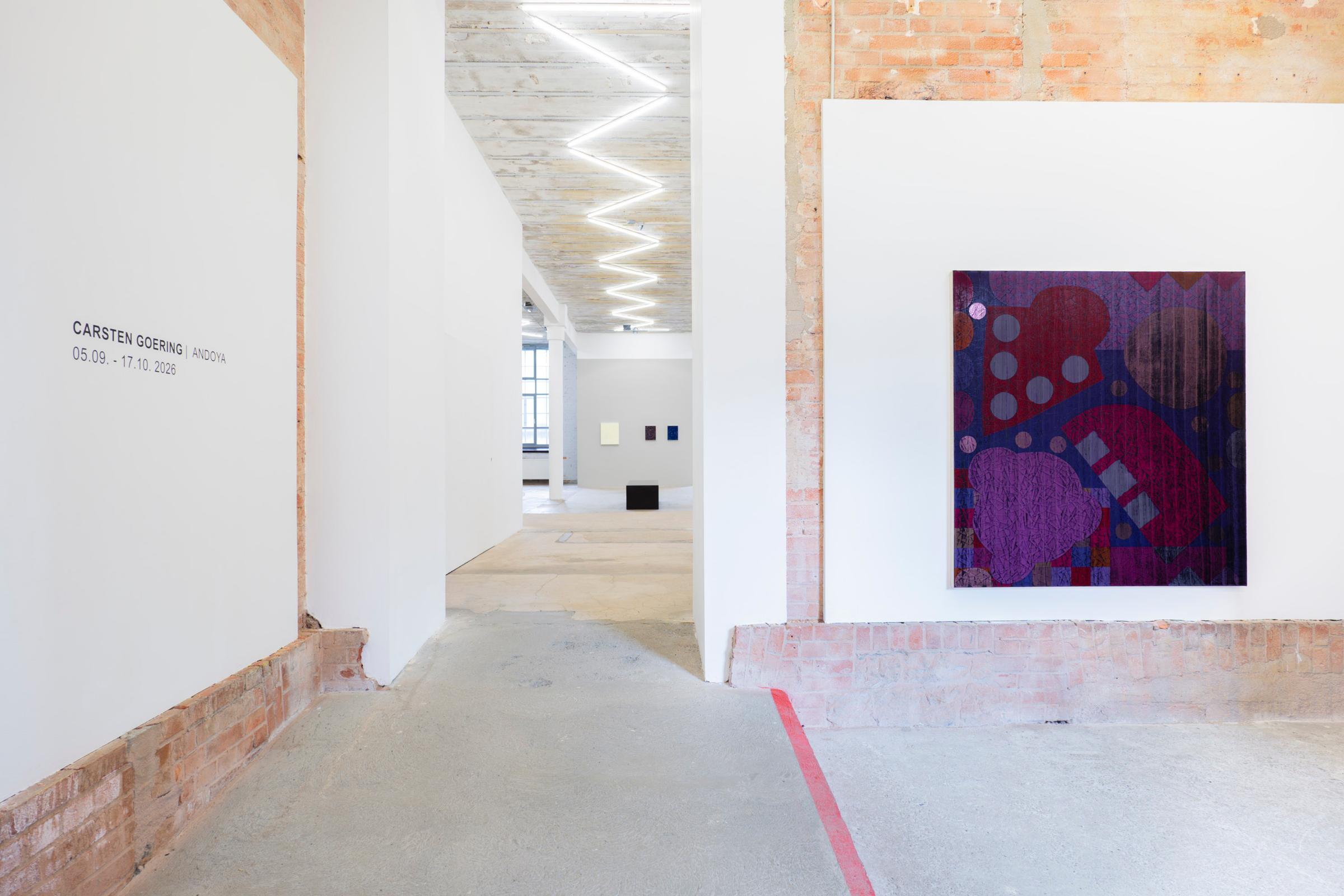
Carsten Goering Andoya
Leipzig 5 Sept – 17 Oct 2026



COLOUR AS STRUCTURED PERCEPTION
In the picture, colour creates the light.”[1]
– Hans Hofmann
The German-American artist Hofmann and his text ‘Form und Farbe in der Gestaltung’ (1931), pervades much of the twentieth century when speaking of abstract painting as it relates to the uses and applications of colour. His observation suggested colour is a structured and process-based conception, one where the eye functions as the mere site of reception. Hence there are
established arguments as to subject-object colour theory and its German aesthetics from Runge to Goethe, Schopenhauer through to Wittgenstein.[2][3] No doubt in part indebted to the forming role of consciousness as first articulated by Kant. Applied in painting such colour theories were integrated into the Bauhaus by the pedagogy of Johannes Itten at Weimar, largely based on Schopenhauer’s physiological colour theories, and in Dessau (after 1925) by the interactive theories of Josef Albers, seminal ideas later fully articulated at the Black Mountain College and Yale in America.[4]
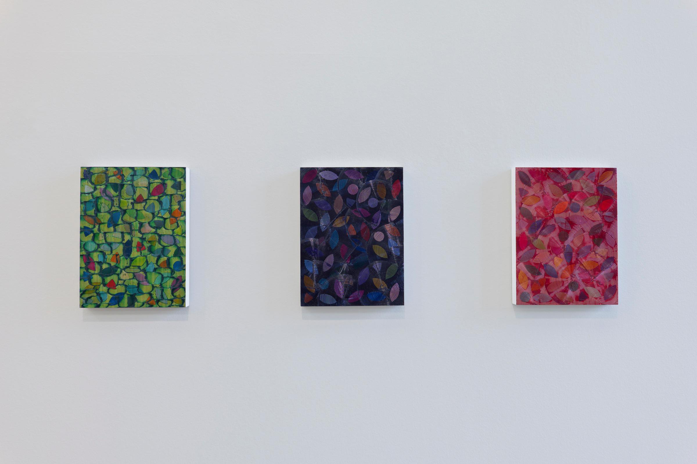
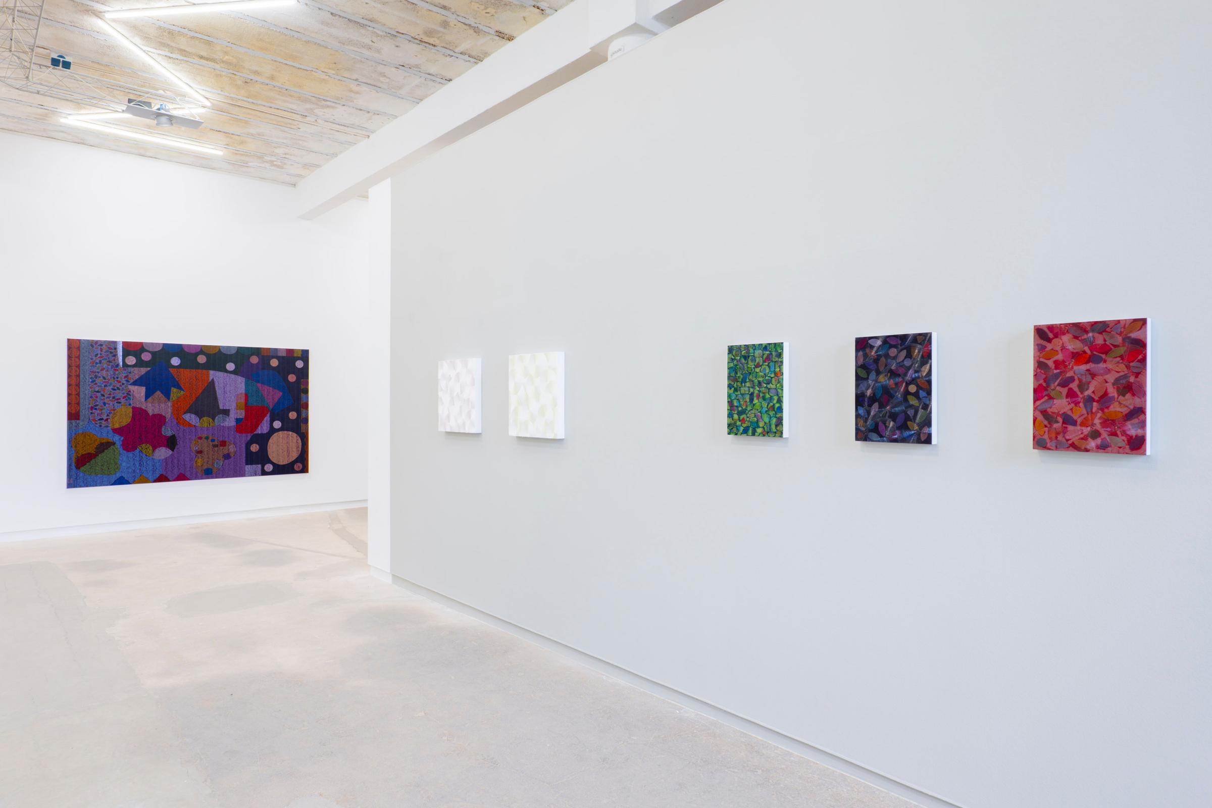
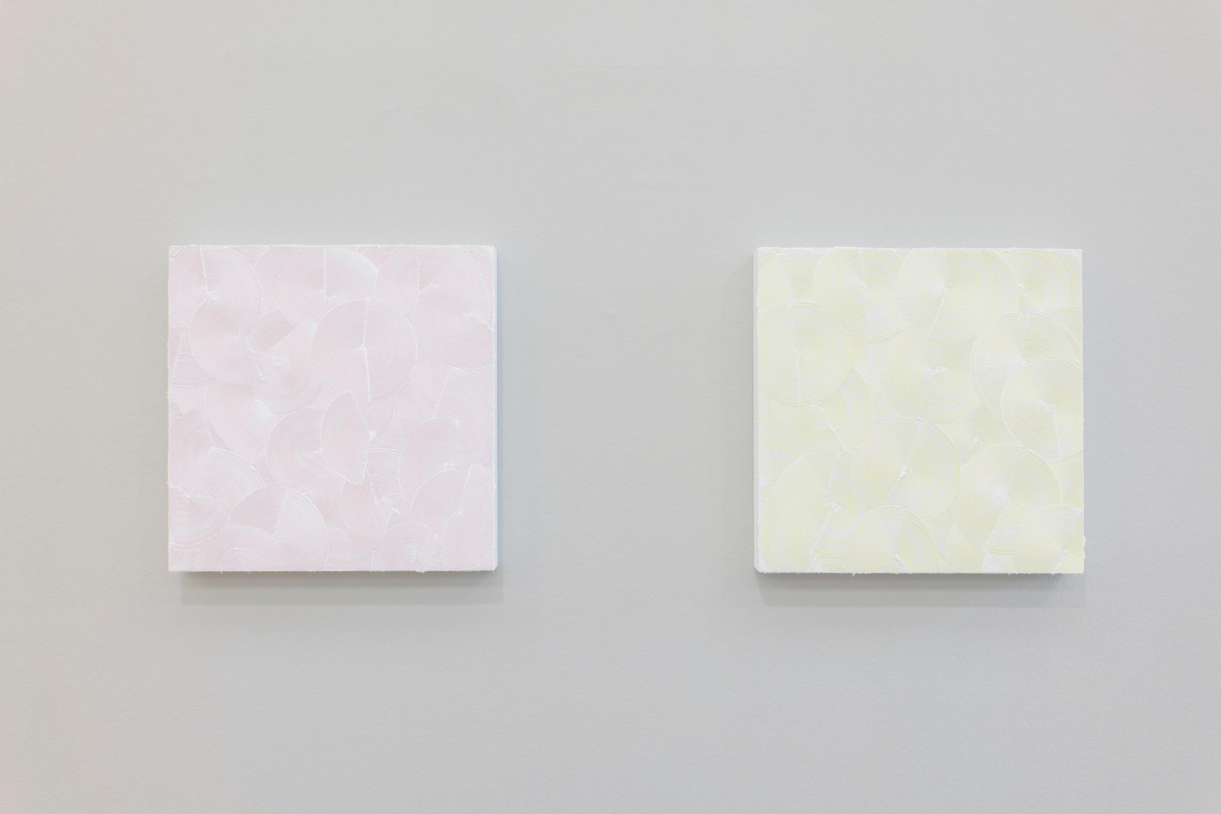
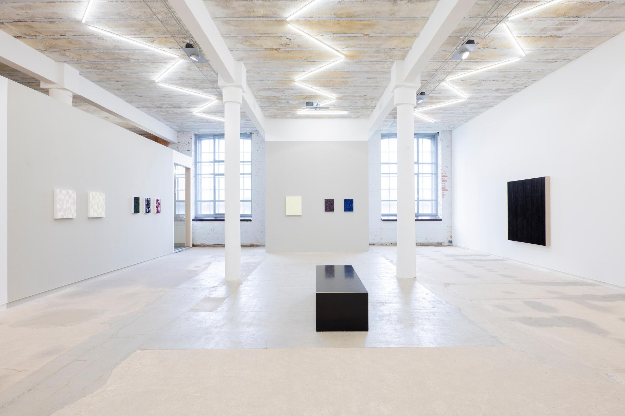
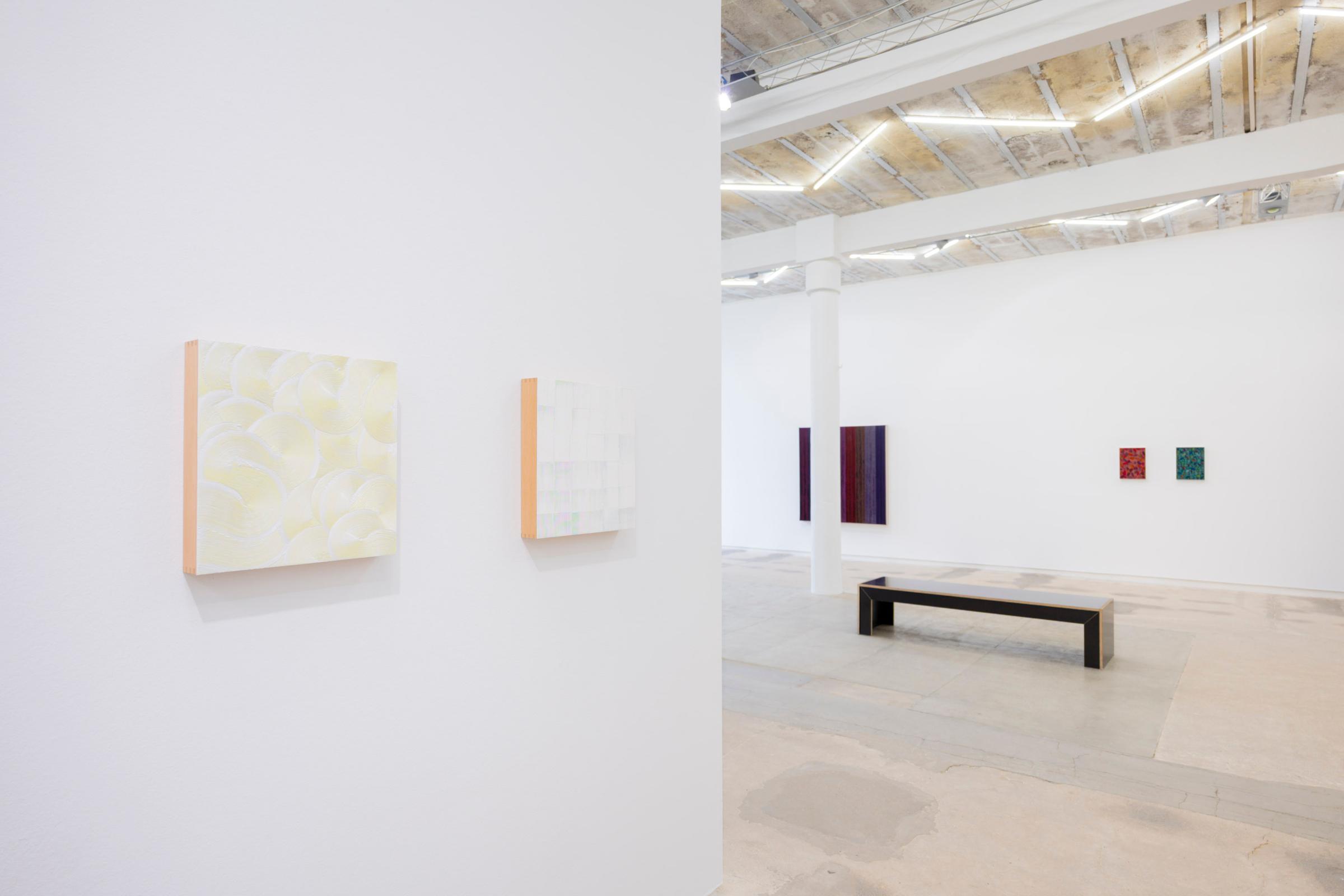
It is clear in Carsten Goering’s paintings that we experience from the outset an artist who is familiar with the historiographical resources relating to subject-object principles in modern colour theory and its concerns, and thence by natural extension to its processing and use in material facture and the visual art practices of today.[5] However in Goering’s paintings he goes beyond the initial state of optical or retinal perception, and he addresses the question of the application of colour as the essential material means of facture. In this respect his use of haptic expression has as much importance as the realisation of the visual, this is because his comb-like form of paint application constantly varies the percept experience by the subtleties of the hand pressure that is applied. Thus the haptic and the visual are in a continuous state of sensory interplay where the use of combed ridges and hand movements, shape the variable outcomes and experience of surface texture. As a result the recipient becomes engaged with a sense of their self-reflective responsive feelings shaped by means of viewpoint and optical perspicacity. This argues that the viewer is visually inflected and drawn towards the cambered (some have called it convex of lenticular) protuberant textures manifested in the paintings.
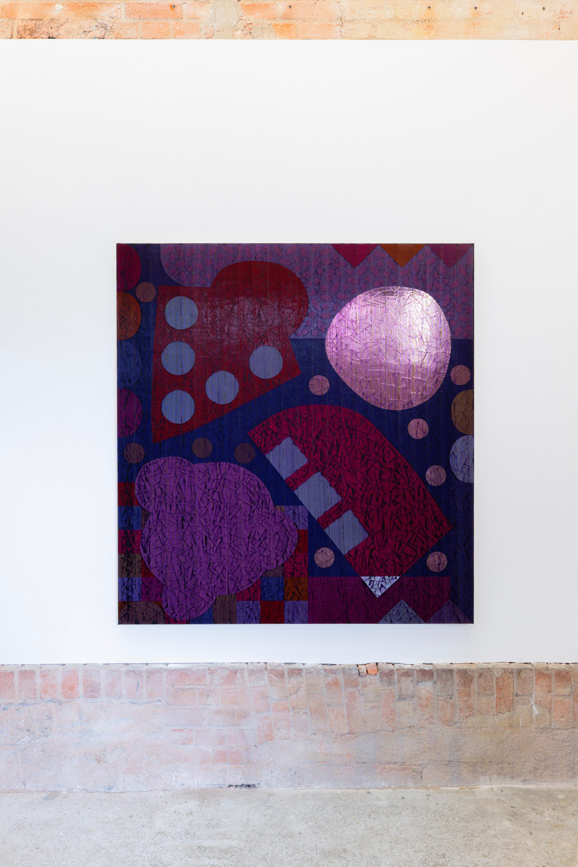
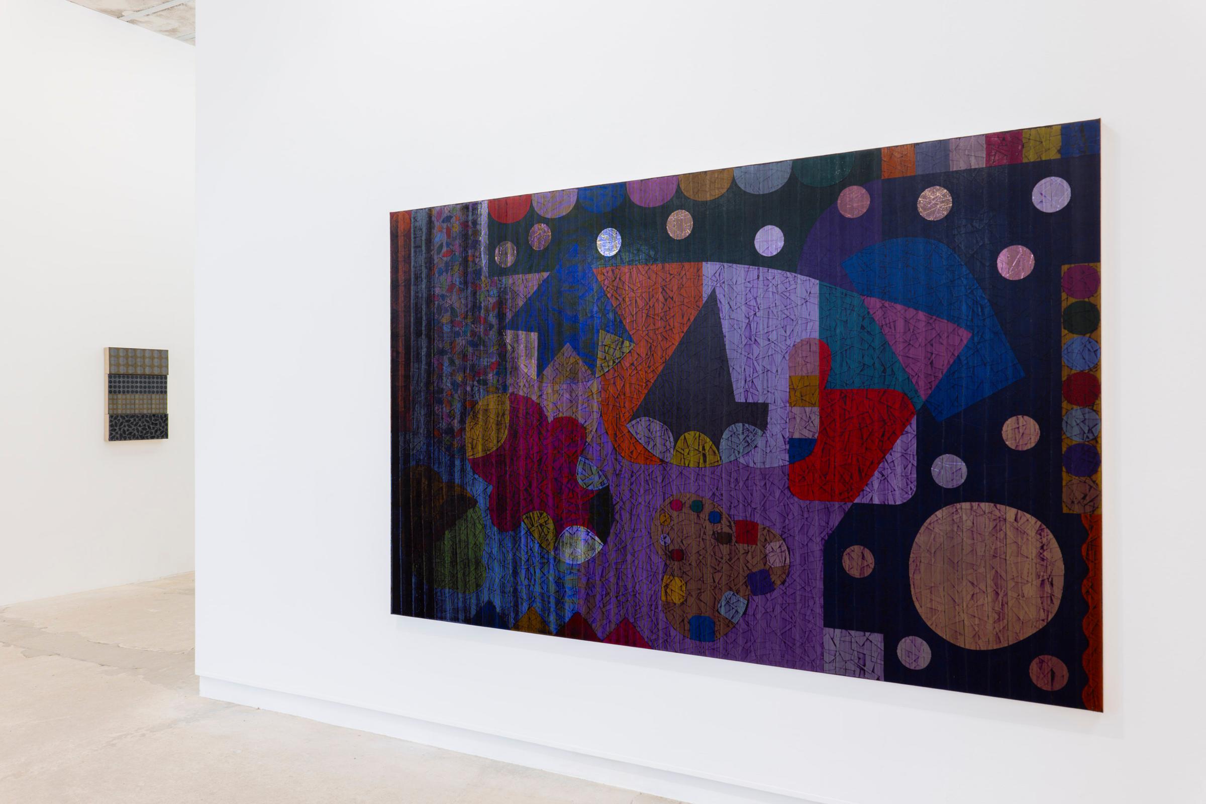
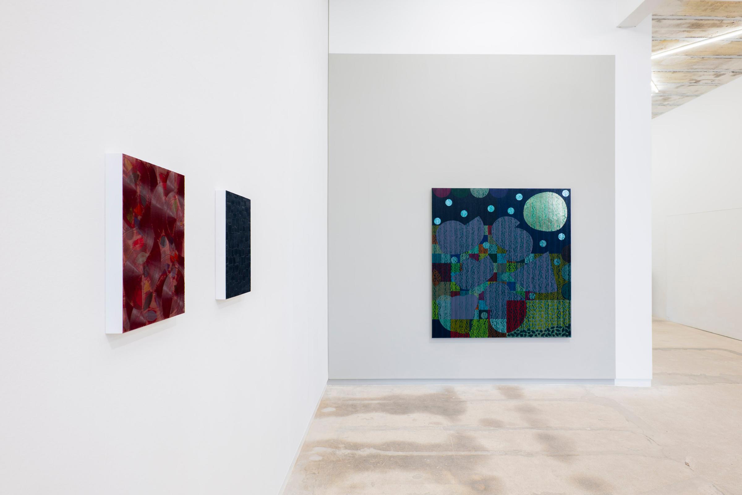
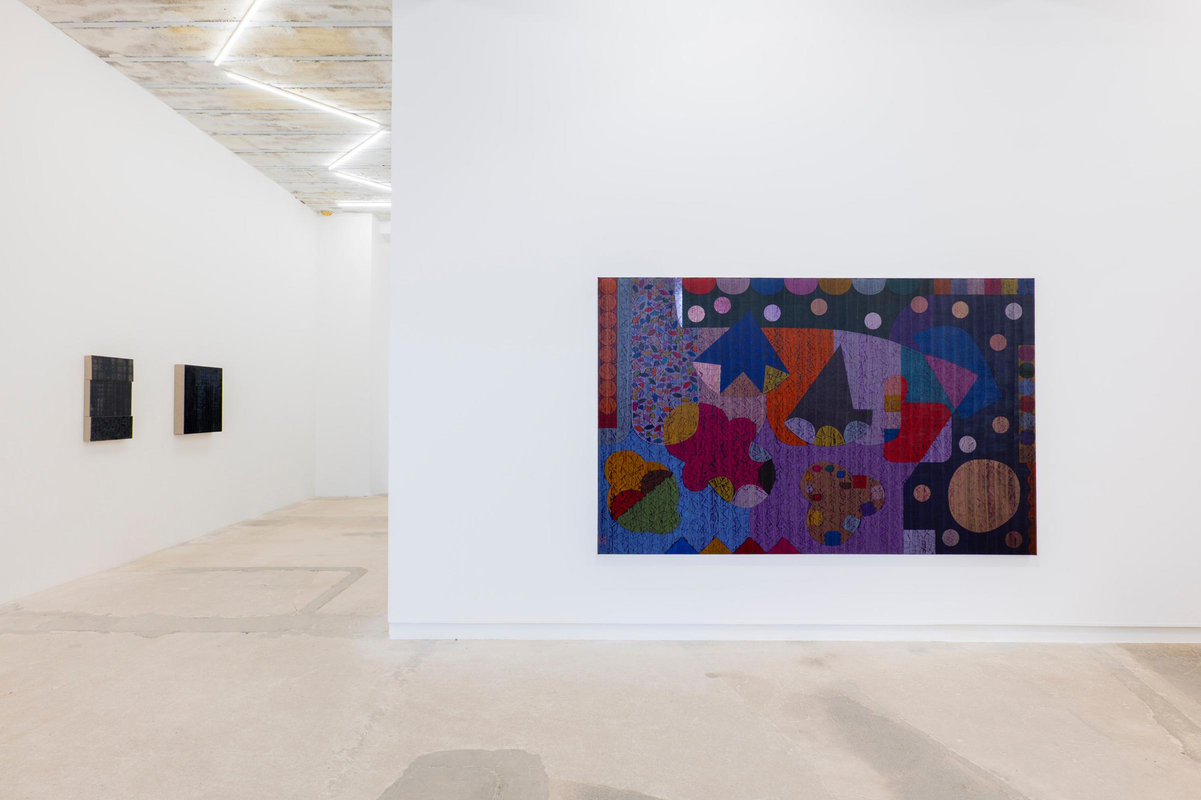
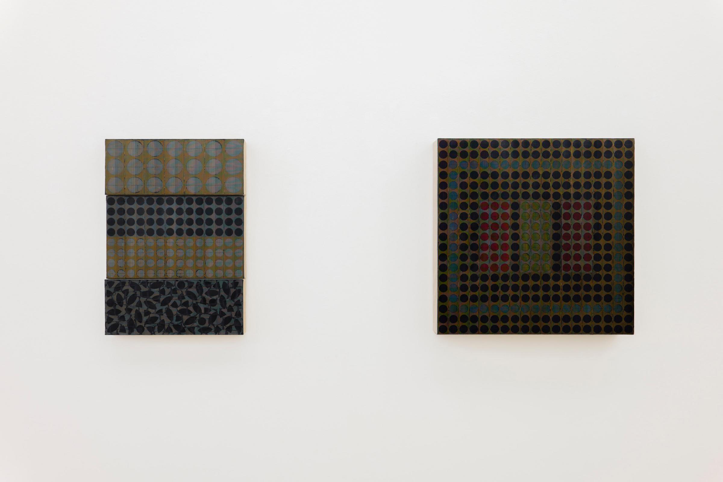
To emphasise the making (facture) does not diminish the enormous influence and role played by colour in Goering’s paintings. As Hofmann observed, natural colours are mediated by light, and necessarily by mutual median variables of light, its transitory diurnal disposition as it affects the fluctuating potency of colour in any given moment. This in turn led to ‘chromophobes’ who have chosen to see colour as merely a secondary quality, subsidiary to the unchanging mass and volume of a given object.[6] Carsten Goering’s more recent paintings have both a dialectical and highly personal relationship between use of pattern and motif, since they carry forward a twofold sense of the optical, that is to say from a distance they appear as luminous collaged pattern fabrics, whereas near to we see subtle variances and shifts in terms of lumen chromatic surface textures. Whereas allusions to lines of containment and configured assertion always existed in Goering’s earlier paintings, the use of line in the recent paintings has become more theatrical (pictorial) using asymmetrical shapes alongside more conventional circular and lozenge forms.[7]
Yet the juxtaposition of coloured forms (shapes) does not constitute a particular schematic applied by the artist, but they nonetheless express a certain sense of ‘gestalt’ or field of visual expression. Most non-empirical theories of colour derive from perception and introspection within modern phenomenological aesthetics.[8] Yet also vindicated as regards the expanded field of ‘Gestaltqualität’ established by Wertheimer, something now widely disseminated in international discourses and shaped by gestalt thinking psychologies evident in the extensive writings of Arnheim.[9] Yet neither seek to challenge the growing experimental field of colour cognition within neuro-aesthetics.[10]
– Mark Gisbourne
[1] Hans Hofmann Das Malerbuch (1948): A rewritten and expanded German version of his 1931 text, translated as The Painter’s Primer: Form and Color in the Creative Process. Updated in a German/English edition by Friedrich Meschede (ed), Creation in Form and Color Hans Hofmann, Berlin, Hirmer Verlag, 2016.
[2] For early German thinking on what was later called physiological optics as they relate to colour, following on from Goethe and Schopenhauer, see the writings of Hermann Helmholtz (1821-94), and Ewald Hering (1834-1918).
[3] As to Phillip Otto Runge and Johannes Wolfgang Goethe, see the Farbenlehre (1810), for Arthur Schopenhauer, On Vision and Colours (1816), and Ludwig Wittgenstein, Remarks on Colour (1950).
[4] Johannes Itten (1888-1967) Kunst der Farbe: subjektives Erleben und objektives Erkennen als Wege zur Kunst was particularly influential on the emergence of OP Art. He taught at Ulm School of Design (1953-1968) in the post war period, the institute most often seen as continuing the ideas first taught at the Bauhaus. For Josef Albers (1888-1976) Interaction of Color (1963), republished in a 50th Anniversary edition, New Haven and London, Yale University Press, 2013.
[5] For the cultural context of colour at any given time, see John Gage, Kulturgeschichte der Farbe: Von der Antike bis zur Gegenwart, Leipzig, Seemann, 2010; also his Die Sprache der Farben, Leipzig, Seemann, 2011.
[6] David Batchelor, Chromophobia, London, Reaktion Books, 2000. The negative view of colour and the accusation that colour is a secondary quality of an object derives largely from the tradition of John Locke (1632-1704) and his ‘empirical’ philosophy. See An Essay Concerning Human Understanding (1690), which categorised sensations such as colour,
taste, smell and sound as secondary qualities in contrast to the mass and volume of an object.
[7]As to distinctions between ‘form’ and ‘shape’ see the chapters in Rudolf Arnheim, Art and Visual Perception: A Psychology of the Creative Eye, (1954 & 1974), Berkeley, Los Angeles and London, University of California Press, 2004, pp. 24-95, 96-161 (updated edition).
[8] As it relates to colour, see the latest research Phenomenology and Colour in the Proceedings of the Conference at Ku Leuven (Husserl Archives Institute of Philosophy), organised by Professors Till Grohmann and Tsun Kan Cheng, where professional papers from the Universities of Liege, Humboldt, and York were presented on the latest colour researches.
https://hiw.kuleuven.be/en/news-events/events/phenomenology-and-colour
[9] Christian von Ehrenfels (1859-1932) was an early precursor of gestalt theory in music, expanding upon ideas first intimated by Goethe’s Farbenlehre, but also influenced by Max Wertheimer (1880-1943, student of Ehrenfels), who taught at the University of Berlin. Here he founded Gestalt Psychology as ‘form, pattern and field theory’ in relation to perception. It also served as the basis for grounding synaesthesia in establishing the connection between music and colour in modern abstract painting. Rudolf Arnheim (1904-2007, a psychology student of Wertheimer) Visual Thinking (1969) Berkeley London and Los Angeles, University of California Press, 2004, was the last founding figure of gestalt psychology and a lecture in homage of his work takes place annually at the Brandenburger Stiftung, Berlin.
[10] For current writings as regards ‘neuroaesthetics’ and colour in art, see Anjan Chatterjee and Eileen R. Cardilo (eds.), Brain, Beauty and Art: Essays Bringing Neuroaesthetics into Focus, Oxford, Oxford University Press, 2021.
In the picture, colour creates the light.”[1]
– Hans Hofmann
The German-American artist Hofmann and his text ‘Form und Farbe in der Gestaltung’ (1931), pervades much of the twentieth century when speaking of abstract painting as it relates to the uses and applications of colour. His observation suggested colour is a structured and process-based conception, one where the eye functions as the mere site of reception. Hence there are
established arguments as to subject-object colour theory and its German aesthetics from Runge to Goethe, Schopenhauer through to Wittgenstein.[2][3] No doubt in part indebted to the forming role of consciousness as first articulated by Kant. Applied in painting such colour theories were integrated into the Bauhaus by the pedagogy of Johannes Itten at Weimar, largely based on Schopenhauer’s physiological colour theories, and in Dessau (after 1925) by the interactive theories of Josef Albers, seminal ideas later fully articulated at the Black Mountain College and Yale in America.[4]
It is clear in Carsten Goering’s paintings that we experience from the outset an artist who is familiar with the historiographical resources relating to subject-object principles in modern colour theory and its concerns, and thence by natural extension to its processing and use in material facture and the visual art practices of today.[5] However in Goering’s paintings he goes beyond the initial state of optical or retinal perception, and he addresses the question of the application of colour as the essential material means of facture. In this respect his use of haptic expression has as much importance as the realisation of the visual, this is because his comb-like form of paint application constantly varies the percept experience by the subtleties of the hand pressure that is applied. Thus the haptic and the visual are in a continuous state of sensory interplay where the use of combed ridges and hand movements, shape the variable outcomes and experience of surface texture. As a result the recipient becomes engaged with a sense of their self-reflective responsive feelings shaped by means of viewpoint and optical perspicacity. This argues that the viewer is visually inflected and drawn towards the cambered (some have called it convex of lenticular) protuberant textures manifested in the paintings.
To emphasise the making (facture) does not diminish the enormous influence and role played by colour in Goering’s paintings. As Hofmann observed, natural colours are mediated by light, and necessarily by mutual median variables of light, its transitory diurnal disposition as it affects the fluctuating potency of colour in any given moment. This in turn led to ‘chromophobes’ who have chosen to see colour as merely a secondary quality, subsidiary to the unchanging mass and volume of a given object.[6] Carsten Goering’s more recent paintings have both a dialectical and highly personal relationship between use of pattern and motif, since they carry forward a twofold sense of the optical, that is to say from a distance they appear as luminous collaged pattern fabrics, whereas near to we see subtle variances and shifts in terms of lumen chromatic surface textures. Whereas allusions to lines of containment and configured assertion always existed in Goering’s earlier paintings, the use of line in the recent paintings has become more theatrical (pictorial) using asymmetrical shapes alongside more conventional circular and lozenge forms.[7]
Yet the juxtaposition of coloured forms (shapes) does not constitute a particular schematic applied by the artist, but they nonetheless express a certain sense of ‘gestalt’ or field of visual expression. Most non-empirical theories of colour derive from perception and introspection within modern phenomenological aesthetics.[8] Yet also vindicated as regards the expanded field of ‘Gestaltqualität’ established by Wertheimer, something now widely disseminated in international discourses and shaped by gestalt thinking psychologies evident in the extensive writings of Arnheim.[9] Yet neither seek to challenge the growing experimental field of colour cognition within neuro-aesthetics.[10]
– Mark Gisbourne
[1] Hans Hofmann Das Malerbuch (1948): A rewritten and expanded German version of his 1931 text, translated as The Painter’s Primer: Form and Color in the Creative Process. Updated in a German/English edition by Friedrich Meschede (ed), Creation in Form and Color Hans Hofmann, Berlin, Hirmer Verlag, 2016.
[2] For early German thinking on what was later called physiological optics as they relate to colour, following on from Goethe and Schopenhauer, see the writings of Hermann Helmholtz (1821-94), and Ewald Hering (1834-1918).
[3] As to Phillip Otto Runge and Johannes Wolfgang Goethe, see the Farbenlehre (1810), for Arthur Schopenhauer, On Vision and Colours (1816), and Ludwig Wittgenstein, Remarks on Colour (1950).
[4] Johannes Itten (1888-1967) Kunst der Farbe: subjektives Erleben und objektives Erkennen als Wege zur Kunst was particularly influential on the emergence of OP Art. He taught at Ulm School of Design (1953-1968) in the post war period, the institute most often seen as continuing the ideas first taught at the Bauhaus. For Josef Albers (1888-1976) Interaction of Color (1963), republished in a 50th Anniversary edition, New Haven and London, Yale University Press, 2013.
[5] For the cultural context of colour at any given time, see John Gage, Kulturgeschichte der Farbe: Von der Antike bis zur Gegenwart, Leipzig, Seemann, 2010; also his Die Sprache der Farben, Leipzig, Seemann, 2011.
[6] David Batchelor, Chromophobia, London, Reaktion Books, 2000. The negative view of colour and the accusation that colour is a secondary quality of an object derives largely from the tradition of John Locke (1632-1704) and his ‘empirical’ philosophy. See An Essay Concerning Human Understanding (1690), which categorised sensations such as colour,
taste, smell and sound as secondary qualities in contrast to the mass and volume of an object.
[7]As to distinctions between ‘form’ and ‘shape’ see the chapters in Rudolf Arnheim, Art and Visual Perception: A Psychology of the Creative Eye, (1954 & 1974), Berkeley, Los Angeles and London, University of California Press, 2004, pp. 24-95, 96-161 (updated edition).
[8] As it relates to colour, see the latest research Phenomenology and Colour in the Proceedings of the Conference at Ku Leuven (Husserl Archives Institute of Philosophy), organised by Professors Till Grohmann and Tsun Kan Cheng, where professional papers from the Universities of Liege, Humboldt, and York were presented on the latest colour researches.
https://hiw.kuleuven.be/en/news-events/events/phenomenology-and-colour
[9] Christian von Ehrenfels (1859-1932) was an early precursor of gestalt theory in music, expanding upon ideas first intimated by Goethe’s Farbenlehre, but also influenced by Max Wertheimer (1880-1943, student of Ehrenfels), who taught at the University of Berlin. Here he founded Gestalt Psychology as ‘form, pattern and field theory’ in relation to perception. It also served as the basis for grounding synaesthesia in establishing the connection between music and colour in modern abstract painting. Rudolf Arnheim (1904-2007, a psychology student of Wertheimer) Visual Thinking (1969) Berkeley London and Los Angeles, University of California Press, 2004, was the last founding figure of gestalt psychology and a lecture in homage of his work takes place annually at the Brandenburger Stiftung, Berlin.
[10] For current writings as regards ‘neuroaesthetics’ and colour in art, see Anjan Chatterjee and Eileen R. Cardilo (eds.), Brain, Beauty and Art: Essays Bringing Neuroaesthetics into Focus, Oxford, Oxford University Press, 2021.
Artists